This guide covers self-serve Design System setup: Rules, Typography, Colors, and components you manage in the Magic Patterns dashboard (not syncing a real component package from your codebase). Our Design Systems feature makes Magic Patterns fundamentally different from other AI vibe coding tools. A Design System is your team’s single source of truth for styling and components. It ensures every design follows the same visual rules and uses the same building blocks.Documentation Index
Fetch the complete documentation index at: https://magicpatterns.mintlify.dev/docs/llms.txt
Use this file to discover all available pages before exploring further.
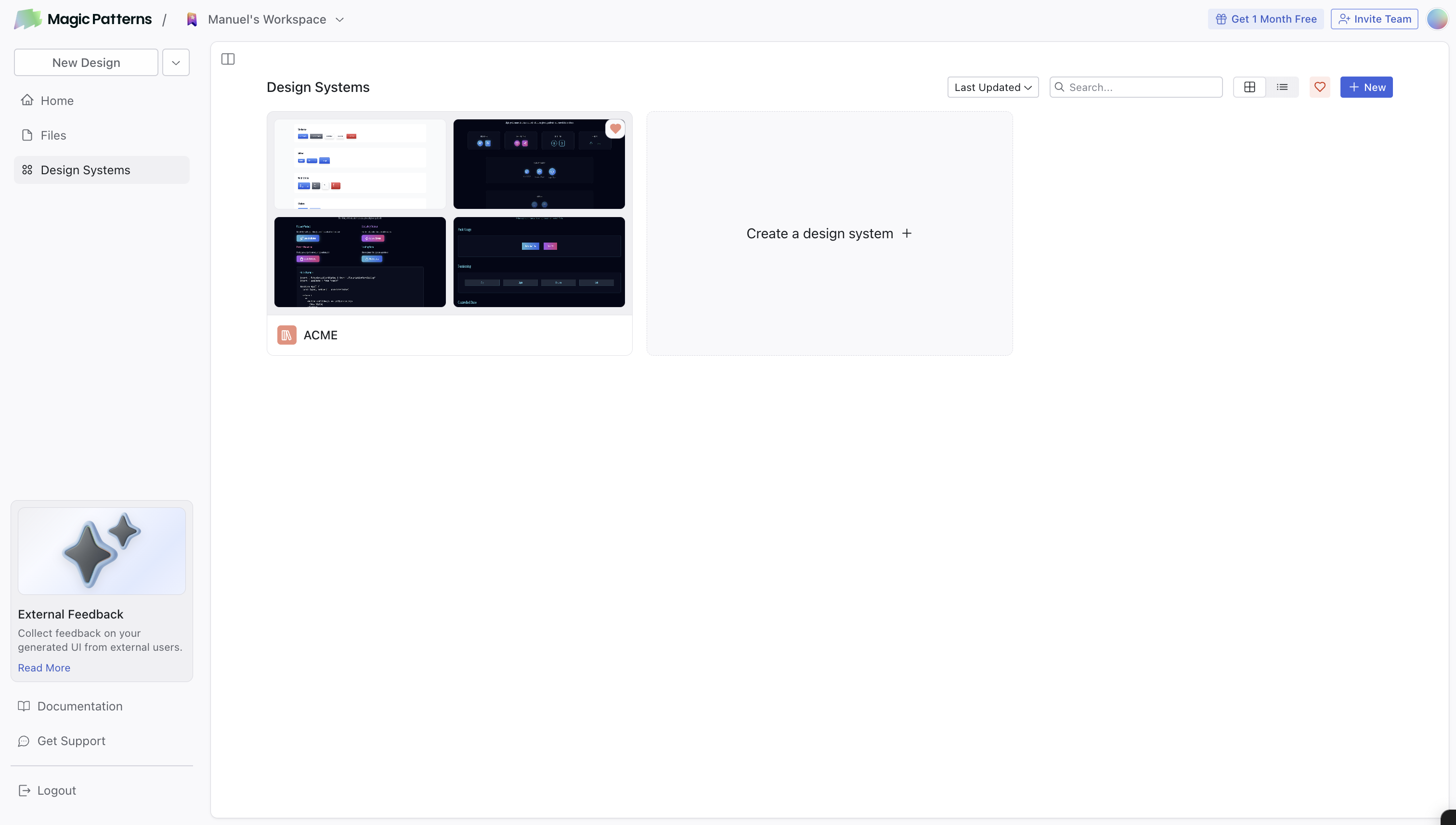
What’s Inside a Design System
| Concept | Purpose |
|---|---|
| Rules | Default styling rules (spacing, visual style, brand voice) applied to every design |
| Typography | Manage font groups: upload custom fonts, Google Fonts, or font URLs |
| Colors | Visually manage your brand color tokens, with dark mode and token references |
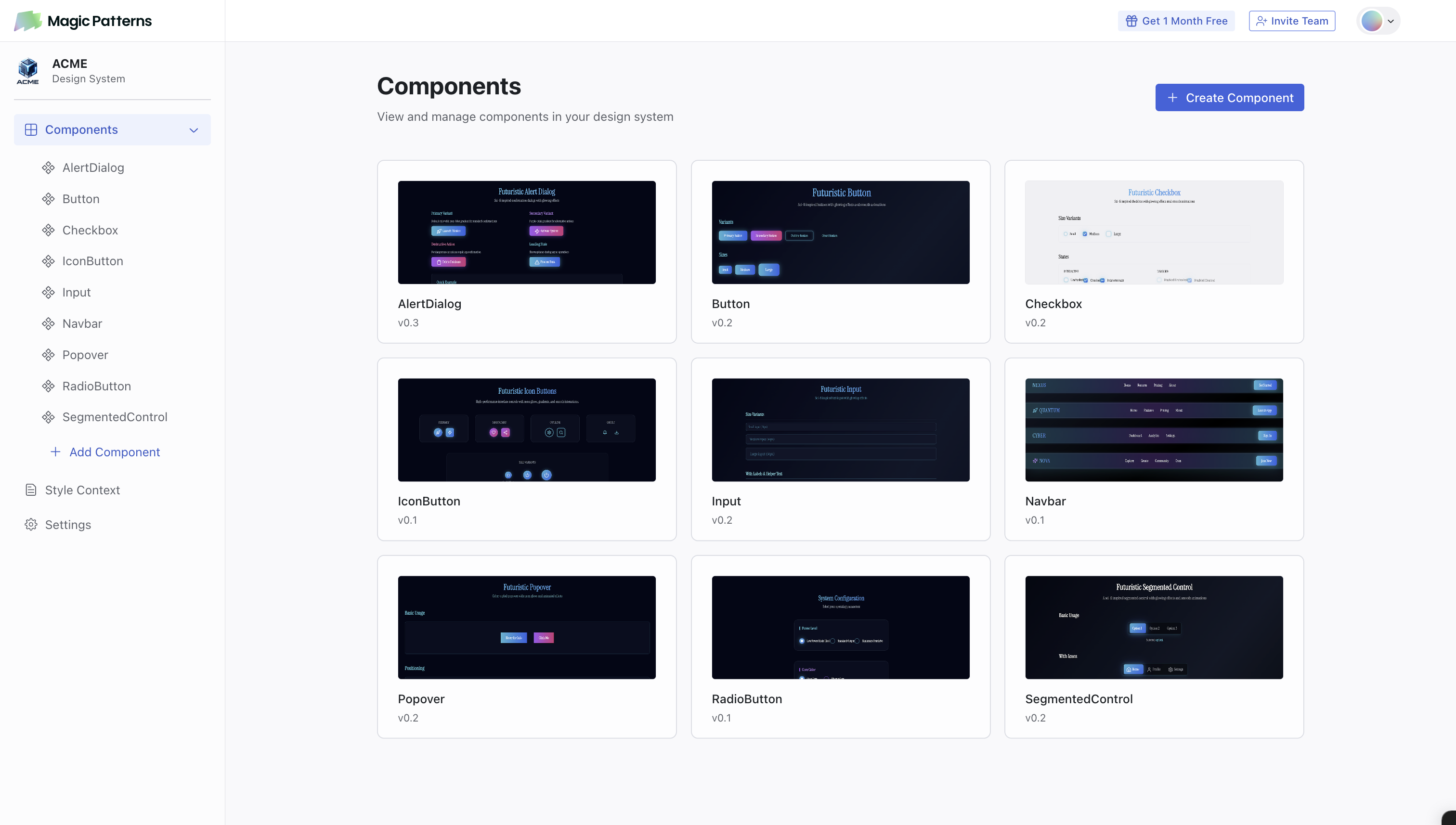
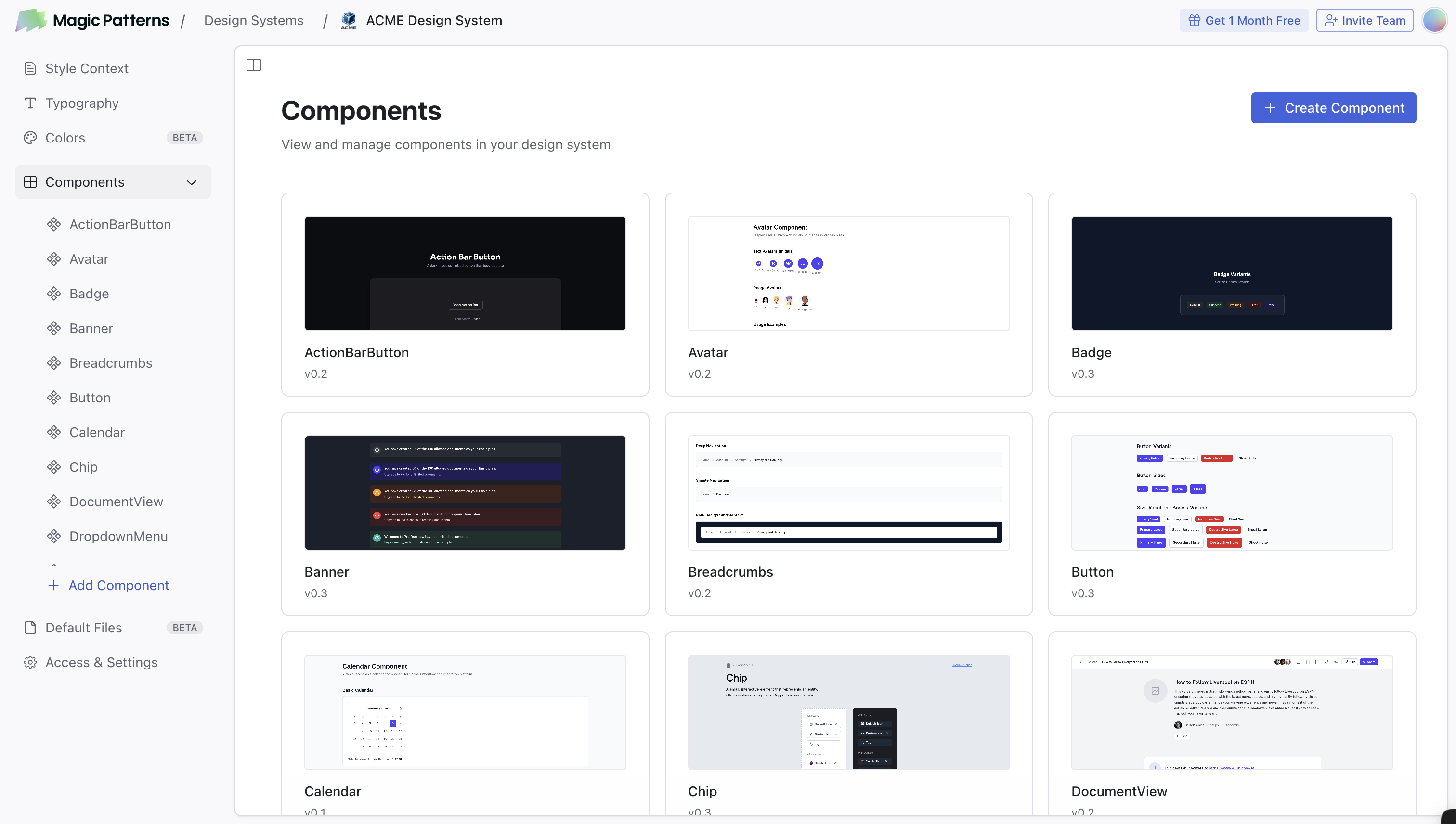
| Components | Browse and manage reusable UI building blocks used across your designs |
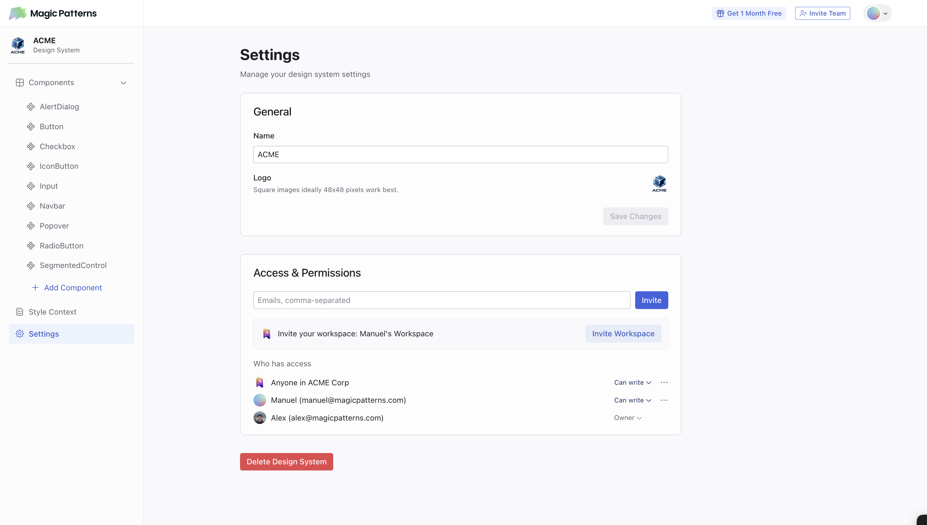
| Access & Settings | Manage sharing, permissions, and other Design System configuration |
Getting Started
Add your Rules
Define your spacing, visual style, and brand guidelines. This acts as a default prompt for all designs.For those familiar with other AI tools, you can think of this as “default prompts” or “skills” that is applied to the context of all designs.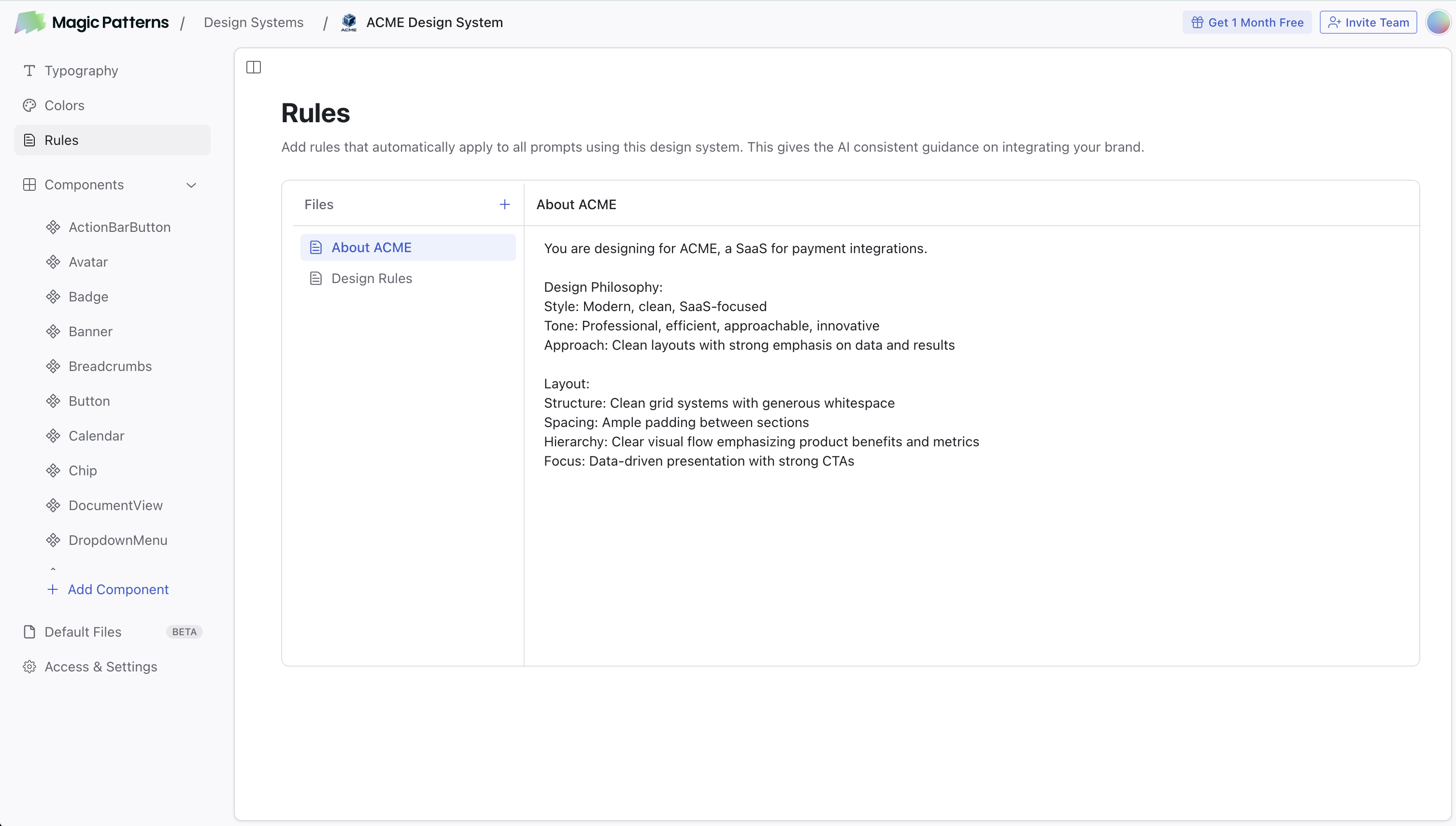
Set up Typography
Go to Typography to manage your font groups. Upload custom fonts, choose from Google Fonts, or paste font URLs to keep typography consistent across your designs.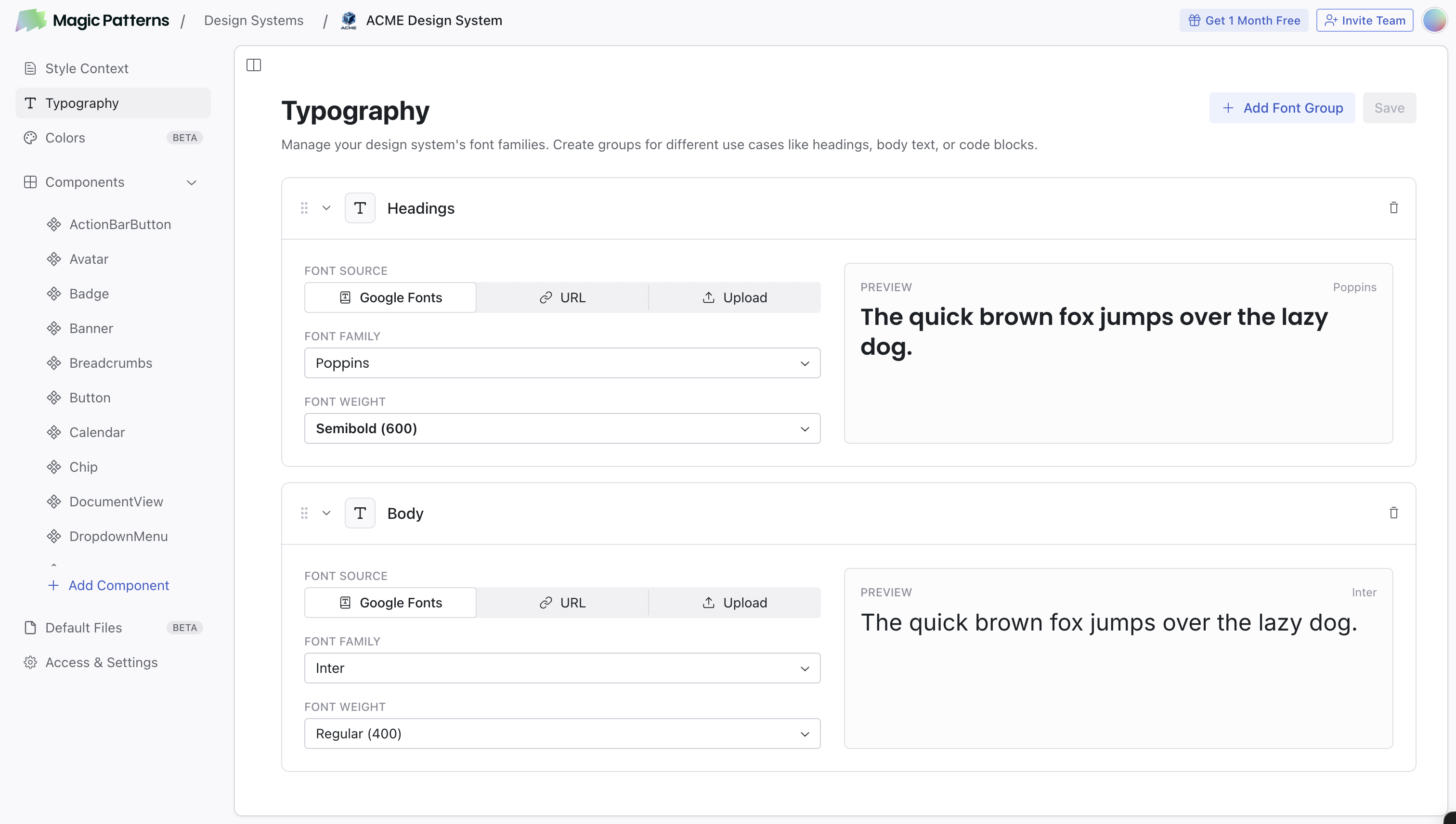
Define your Colors
Open the Colors page to set up your brand palette with colors like Primary, Secondary, Accent, and more.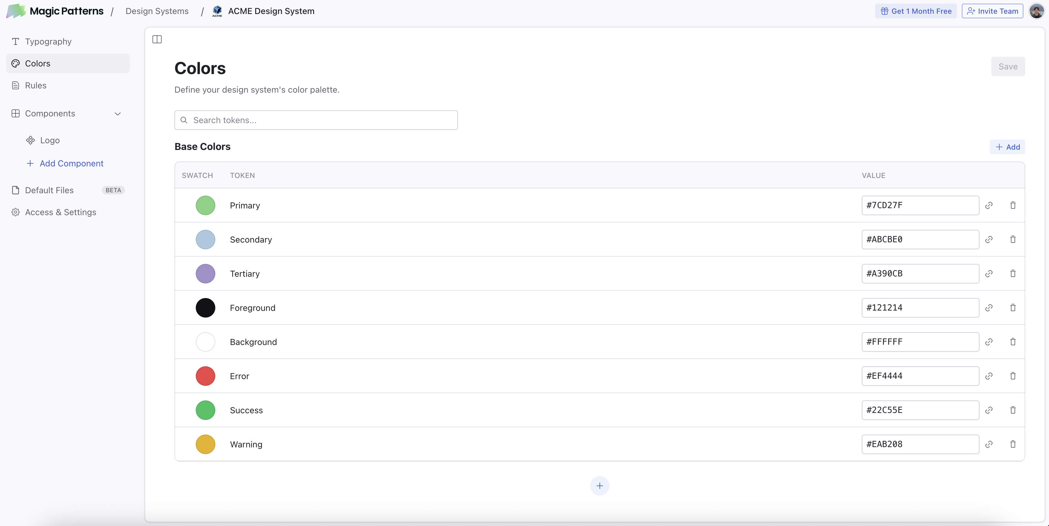
How to Use It
When creating a new design, select your Design System from the dropdown. The AI will automatically:- Apply your Rules
- Use your color tokens from the Colors page
- Use your Typography font groups
- Use components from your Design System when appropriate
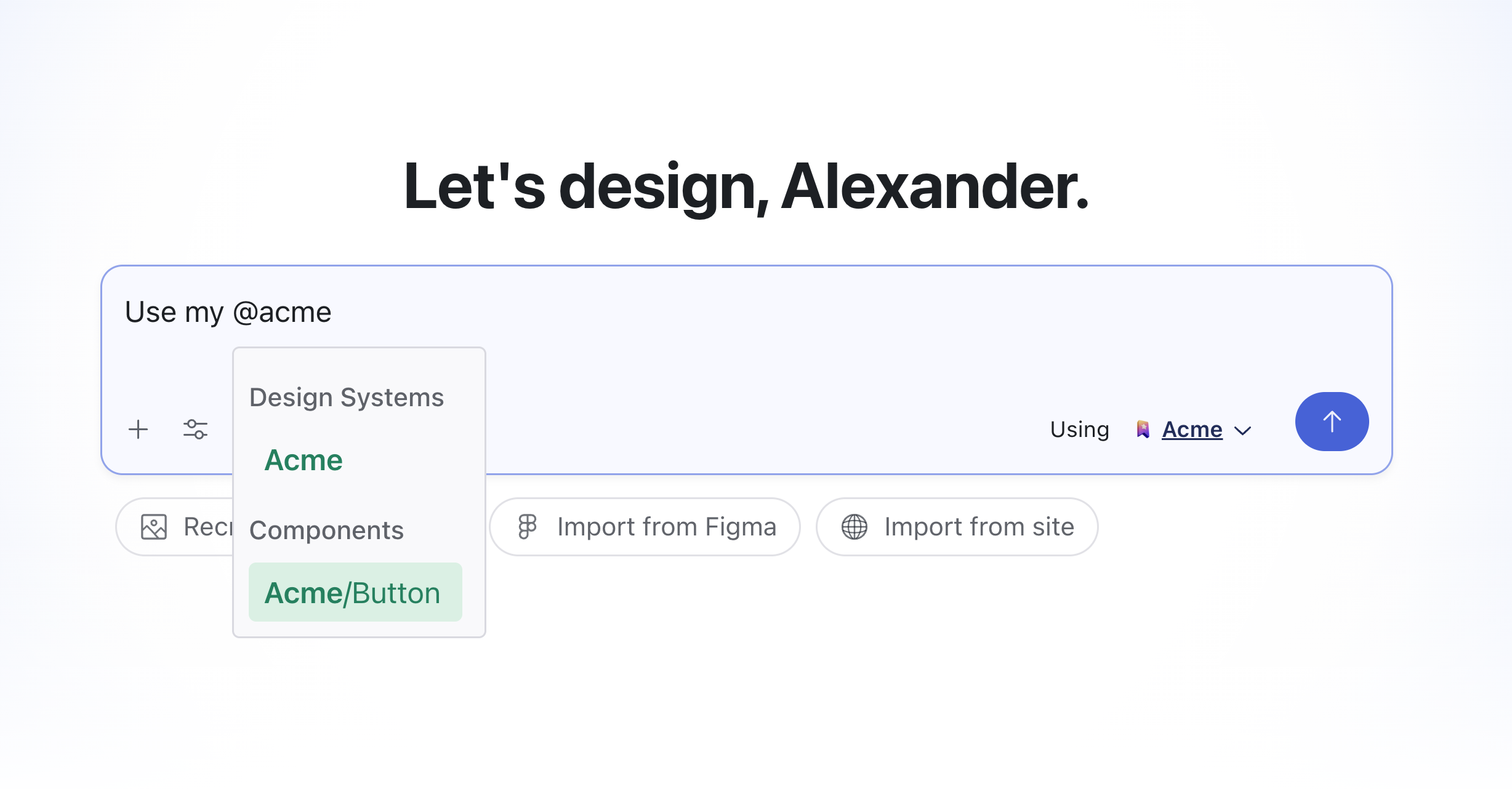
@:
Controlling Access
- Open your Design System
- Click Share → Invite Workspace
Learn More
Colors
Visually manage your brand color tokens with dark mode and references.
Rules
Write effective styling rules with examples and naming tips.
Using Components
Create, edit, and manage components in your Design System.
Converting Design Systems
Switch a design from one Design System to another.
Import from Figma
Bring your existing Figma designs and components into Magic Patterns.
Typography
Manage font groups: upload custom fonts, Google Fonts, or font URLs.